INVENTORY UX
ADVANCED / LEAD UX DESIGNER | SMITE 2
PROBLEM STATEMENT
Throughout the SMITE 1 item detail experience, Titan Forge has design and implemented multiple layouts with varying interactions and navigation systems, all achieving the same objective. Players could highlight an item, with dedicated space for viewing its 2D or 3D asset and price. However, developing different layouts and interactions for the same functionality introduces unnecessary complexity for players, increasing development costs which ultimately lead to negatively impacting the developer and player experience.
Each new interface requires players to adapt to a different flow, which can hinder proficiency and create friction. Given that this screen is centered around microtransactions (MTX), it is crucial to minimize interaction costs. MTX interfaces must clearly convey their purpose and be intuitive to navigate to ensure a seamless and engaging experience.
Below are examples of these screen, all which were present in the same build.
LEGEND
Red Inventory Grid | Teal 2D/3D Asset window | Yellow Name & price
SOLUTION
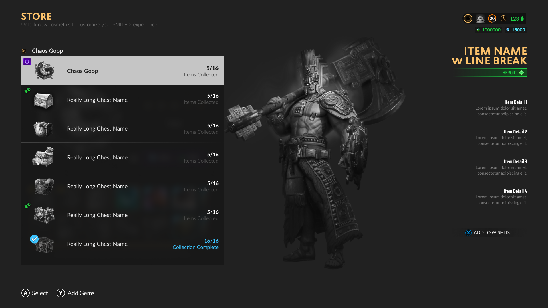
Create a new, multi-purpose screen that can display any type of cosmetic item, and more. With an Interactive Grid space that can use any configuration long as it fits in the same widget. It must provide significantly more room to view the assets, and potentially the option to hide the UI. Finally, item information has been expanded upon with a proper Item Details section that displays more data about the highlighted item on the right side. This information was never displayed in SMITE 1, and will surface important details such as Unique VFX, SFX, and Animations which could potentially add more value to the player.
STAKEHOLDER NOTES
Intuitive
Strong emphasis on the physical representation of the asset
UX GOALS
Create an intuitive Store experience that can be used throughout the game, and handle multiple use cases to help reduce development costs.
Allow for a reasonable amount of room for the asset to be viewed, regardless of what type of item it is.
MY NOTES
Reduce development costs
Intuitive layout with multiple applications
Available to use throughout the game
Provide item details
Ability to play with the asset.
Add a space for the Monetization team to provide important details about the item that will help players learn more. A need that is missing from SMITE 1.
Introduce the ability for players to “test drive” the items in practice, from within the Store, for players to play with.
INVENTORY UI (NEW)
Using strong visual hierarchy, this layout will help guide the player’s eye through interaction and presentation.
INVENTORY UI WITH DIFFERENT APPLICATIONS
Below are three wireframes where the asset, and the grid are different to show how the screen serves different applications.
SMITE 1 CHEST SCREENSMITE 2 CHEST SCREENSTORE CHEST SCREEN
This is the SMITE 1 Chest screen, a bit of a clunky experience, which can be found in the Store. The interaction grid, displayed as a horizontal menu located at the bottom of the screen, is often missed the first time a player enters the screen.
Below is an example of how the Inventory UI screen can also be used in this Chest space located in the Store.
SMITE 2 CHEST SELECTIONRETURNOTHER UX DESIGNS


